Close looking · Published · Updated
Bokashi: reading colour gradation in Japanese prints
Follow a patch of sky from dark to light. Does the colour stop at a firm edge, change in steps, or gradually fade? That small question gives you a way into bokashi, a family of techniques for creating graduated tones in Japanese woodblock printing. Start with the shape of the transition, then ask what the collection record can tell you about the particular sheet.
How a printed colour can change within one area
A carved colour block defines an area that can receive pigment. The printer can vary the application across that area to create a transition in tone. Wiping and moisture are part of the vocabulary of gradation printing. The Ashmolean describes how this gave printers a way to suggest changing sky and water in landscape prints. It also explains the creative contribution of the printer alongside the designer, carver and publisher. Read the Ashmolean account.
The term covers several approaches. JAANUS distinguishes wiped gradation, including horizontal bands, from gradation involving the preparation of another block. A useful first observation is therefore the direction and extent of a colour change. A precise technical name needs evidence about how the printing was done. See the JAANUS entry.
Look at a whole print before zooming in
In Hokusai’s Under the Wave off Kanagawa, start by locating Mount Fuji, then look at the broad sky around it. Compare the quieter sky with the much sharper edges of boats and waves. Trace one colour transition with your eyes and describe where it begins and ends. Keep the full composition beside any enlarged detail so you can still explain what that passage does in the picture.
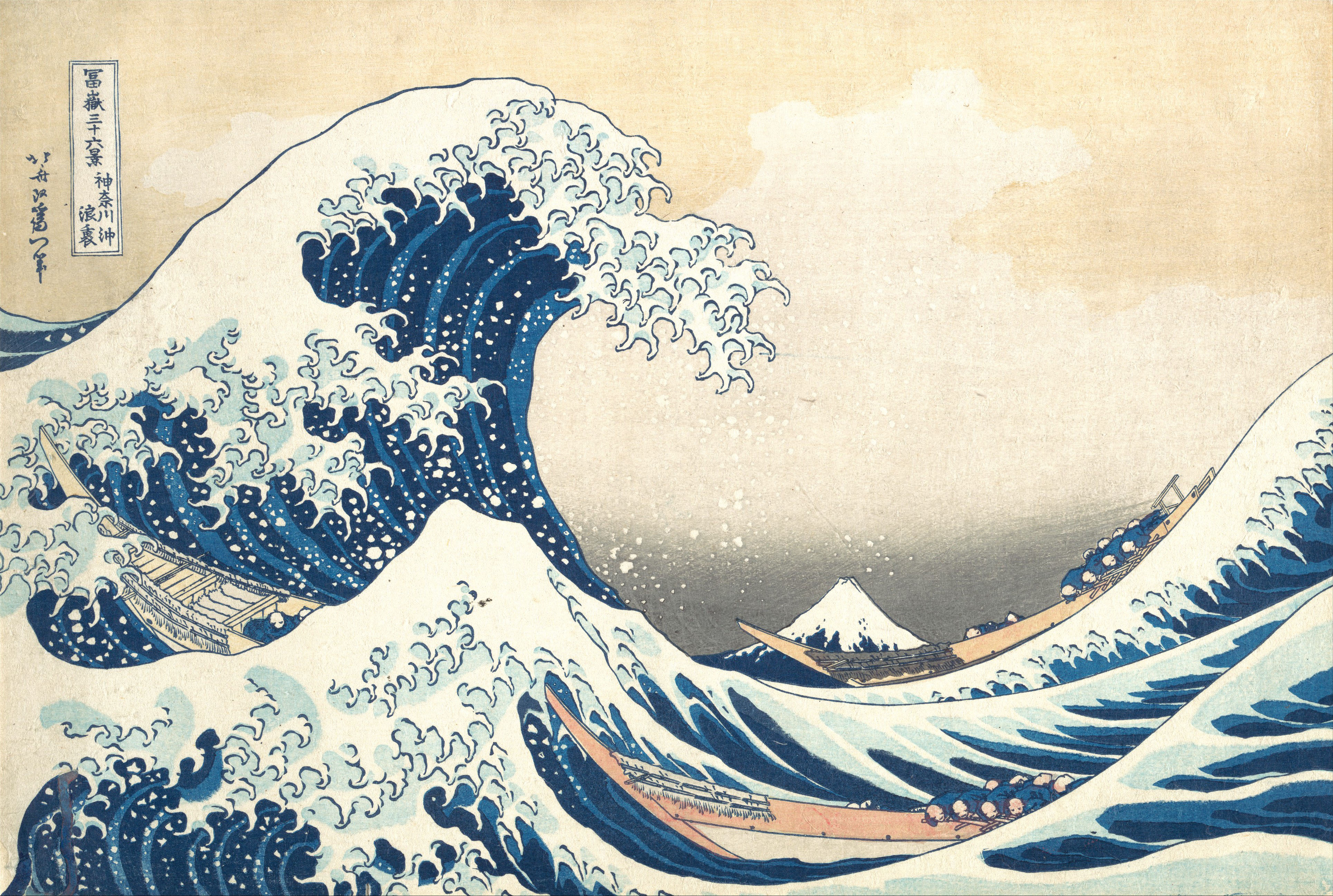
A five-minute looking exercise
- Choose one passage. Pick a small area of sky or water. Write its position in ordinary words, such as “the sky immediately above Fuji”.
- Describe the transition. Record its direction, width and edges. “Dark at the top, becoming pale toward the mountain” is more informative than “beautiful blue”.
- Compare a second area. Find a hard edge elsewhere in the same image. Explain how the soft passage and the firm edge guide your attention differently.
- Keep an uncertainty note. Separate the visible observation from a question about materials, printing or condition. A digitised image leaves the paper surface and viewing conditions partly unresolved.
- Keep the object identity. Save the museum name, accession number and direct record link with your notes. Those details let another reader find the same impression.
Comparing two impressions
A design can survive in many individual impressions. Open two collection records side by side, match the same area, and write down one visible difference. Describe it first as a difference between the displayed images. Printing choices, later condition and photography are separate questions to investigate with the records. Keep the institution’s own dating and attribution attached to each object. The community source checklist helps organise that evidence.
A fade, a printed edge, or a feature of the photograph?
Start with the shape of what you can see. Follow one strip of sky from top to bottom, then follow the same strip beside it. A gradual transition may occupy much of the band. An abrupt colour boundary follows a line you can trace. A dark area that also crosses the paper margin deserves a separate note about the photograph or the sheet’s condition.
Compare the sky above Fuji in the Met’s two impressions of The Great Wave. Open JP1847 and JP10 at similar zoom. Use the mountain summit and the rim of the wave as landmarks. Note where the tone changes, which way it changes, and whether a line remains visible through it. Keep each accession number with its own observation.
Then pick a different passage, such as the dark hollow of the wave. Here, the Met used examination of the physical print to identify overlapping impressions of blue ink. A close-up on a screen can help you locate that passage. The museum’s analysis supplies evidence about how it was printed. Read Marco Leona’s account of the examination.
Use two lines in your notes: Visible in the image and Supported by the record. Put the direction and position of the change in the first line. Put the object number, source link and any published examination in the second. If the record leaves a question open, keep it open in your caption.
Continue on iPhone or iPad
Ukiyo-e brings together Japanese print records with links to their sources. You can use the free app to look through works and keep a collection image as your reference. Where My Color Edition is available, the free Indigo choice offers a starting point for a personal palette experiment. Label your saved colour edition as your interpretation and retain the collection credit when sharing.
The app is a free download for iPhone and iPad, with an optional permanent unlock for additional choices and export formats. Follow the first-print walkthrough for the current entry steps. Prepare selected works for offline viewing before a class or trip.
Image source and reuse information were checked on November 9, 2026. The Met labels this object Public Domain. The Met Open Access policy. Research notes and the explanatory diagram are by CannedRocket. Contact Alex Carter at alex.carter@saltyisland.dev for a source correction.